
I could probably make the list longer than 5, but then you’d end up becoming overwhelmed and likely not implement any of them. Today I’m going to focus on 5 simple tips for improving your website, that you may have overlooked previously.
If you have any questions or help implementing my suggestions, drop me a message in the comments section below. Add your own tips as well.
1. Stop Using Left Or Right Aligned “Thumbnail Pics”.
I’m talking about this kind of thing. I really think it looks outdated, amateur, and doesn’t really add much to the purpose of breaking up text. Try a full width banner instead. A lot of sites will do well with a 630 x 420 pixel image, but double check your theme will support that without looking out of place.
I tend to only use one image at the top of my article, and break up text with headings and other techniques. Try it, and see how much better your content looks.
Additionally, don’t make your images link to their media file. If you want your image to link to another post/page or website, that’s great! Just don’t have an image clickable, and when someone clicks it, they just get the image on a blank page.
By the way, if you’d rather stop using free, low-quality images, and would like to learn more about premium images. Check out my Fotolia image library review.
2. Increase Your Font Size.
Make your font size 16px or higher. Some themes come standard with settings that will let you adjust this, while others will want to use the UltimateTinyMCE plugin to adjust their font size. It’s better if you can just adjust the whole size of your font by default though, without having to adjust it on every post.
If you don’t have the option to increase font size built into your theme, I recommend installing the free “My Custom CSS” plugin, then adding the following code to it:
p { font-size: 16px; }
Make a backup of your site first, and if anything goes wrong, just delete that code.
3. Remove Adsense.
Unless Google Adsense is making you significant bucks, I’d say remove it. It’s hard to get the adverts right without looking out of place, and a lot of people tend to scatter the ad blocks all over their pages in order to get a few extra dollars a month.
Is it worth it for making your site look terrible?
Equally, why not learn about affiliate marketing and make some real money with your site instead?
4. Keep Banner Ads Relevant And Not Overbearing.
I’ve seen sites that have three or four banners on them for some affiliate product or other. When they are relevant, one or two are enough to generate income for the site. You shouldn’t need 4 or 5 all over the place in an effort to catch a sale. Once again, it makes your site look cheap, and distracts people from noticing the quality of your content.
What’s worse is when the banners aren’t relevant. Someone might have a blog about gardening supplies, with a banner explaining where they got their logo designed.
Another person might have a great website about making movies, and then have a banner for web hosting. It just doesn’t fit, and nobody is going to click them.
If you give people solid advice about something, and a nice link to follow to learn more (or buy a solution), that’s all you’ll need.
5. Break Up Text And Use Headings
Use H2,H3 and H4 tags to give titles and sub-titles to your sections. Additionally, try to do a new line break every 3 or 4 lines. I’m not talking about abandoning a line mid-sentence, I’ve actually seen people do that before.
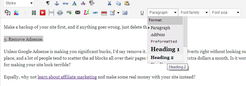
Just have a space every couple of lines. It’s easier on people’s eyes, and it’s great for those who “scan” (scroll down quickly) your article.
Bonus Tip: Think Like A User
As you browse the web and visit other people’s sites, try to think about what works and what doesn’t. When you see an ugly site with a wall of text, no formatting, no titles to help you get the point, small thumbnail images that open up as larger versions, chances are you are going to think twice about reading that article.
If you’ve got a particularly high bounce-rate, it’s a sign that your content needs improving.
Want to learn a bit more about CSS and how it can help you tweak your content? Visit our eBooks section to get your free CSS primer!
