
As well as growing Humanproofdesigns and constantly trying to deliver better service to you guys, I’m also constantly working on my own niche sites to try to improve conversions, boost traffic, and to generally see what does and doesn’t work.
The amount of time I can dedicate to these sites doesn’t really allow much room for increasing traffic, but when it comes to improving conversions, there are loads of different things to be tried.
In this post, I’ll talk one of the latest things that I’ve tried across a number of sites, and discuss how the results went. This should give you some great ideas for things to test on your own sites.
WordPress Comparison Tables
There are two sites I own that have a decent amount of traffic to one or two “buying” pages. The sort of pages like “Best XYZ”. After studying a few other sites, I decided to implement a comparison table and see if I could boost conversions.
I had mixed results, but mostly conversions at Amazon have increased massively. It’s always hard to tell if this is because of something you did or because of the summer and the economy getting better, so people tend to be spending more money across the board. When your conversions increase by that amount though, it’s fair to assume you did something right.
Why mixed results?
With my Kettlebell site, I wanted to boost my Amazon conversions while maintaining my Dragondoor conversions, as they offer a higher payout.
I DID increase the Amazon conversions, from about 20 sales a month to about 40-50 (80 last month), but Dragondoor has been mixed. Last month I still got around $100 in sales at Dragondoor, but the month before I got almost nothing. This month I’ve made about 2 sales, so the verdict is still out.
Overall
The actual income is about the same now. However I view increased Amazon conversions as much more beneficial as there is the potential of a huge payday should one of those conversions do a large amount of shopping, or if somebody buys a high ticket items. I’m guaranteed a 6.5% commission and enjoy around 15% conversion rate at Amazon which is huge.
Since I am planning to start a few “high ticket” Amazon sites throughout the rest of the year, having lots of smaller sales bumping my commission up to 6.5 or even 7% is worth a lot more.
Implementation
If you fancy setting up your own comparison charts, there are a couple of simple ways of doing it. The first is to use TablePress, a free plugin that let’s you set up tables how you like, and the second is the manual way that I did it, using this website and its template.
It’s a bit tricky for beginners to use, but once you’ve got your head around where to stick the CSS and HTML coding, it’s actually quite straightforward.
If you have no idea about CSS or HTML, use the TablePress plugin.
Here’s how I set up my charts.
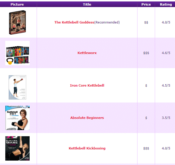
I made the title and the image a link, so that people would click to find out the price, and hence get my Amazon cookie in their browsers. I haven’t yet tested conversions if I actually list the price, but it’s something I will do at some point down the road. I imagine it will be lower though.
I did basically the same layout on my two largest posts on two sites, and both of them had an increase in conversions, although the Kettlebell one was a lot better. This is because it gets more traffic, the products cost less, and there are much more products to choose from.
I’ll continue to use these product comparison charts in future as they are currently a very good way of getting passive conversions.
I’ll keep running tests and experiments across my sites and reporting the findings here, so make sure you’re subscribed to my latest posts.
Have You Had Any Experience With Tables?
What else do you recommend testing to boost conversions? Let me know in the comments below!
